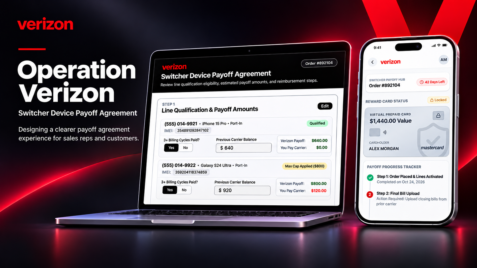
The Problem
THE MOMENT THAT STARTED IT ALL
When the problem became personal
Working as an Inside Sales Representative gave me a firsthand look at the customer experience beyond the initial sale. I encountered customers who believed their previously financed devices would be paid off, only to discover their reimbursement had not gone as expected.
Then a customer I had personally helped contacted me weeks after switching. They were facing that same problem. I hated knowing that someone I had assisted was now dealing with a financial obligation they hadn't anticipated. All I could do was direct them to the appropriate support channels.
What if the problem wasn't simply human error? What if the experience itself needed to be redesigned?
That question became the starting point for Operation Verizon. I wanted to explore a process that could protect customers from mistaken expectations while giving representatives a more reliable way to qualify offers.
Pressure to move quickly
Eligibility rules compete with call handling, customer questions, and order completion.
Expecting a straightforward payoff
A verbal promise may not communicate every requirement, limit, or post-sale action.
The Hypothesis
Looking beyond one customer
I started asking how many other customers had experienced the same confusion and how many representatives might have overlooked an important requirement. One question led to another, and a small investigation grew into a broader exploration of promotional eligibility, customer expectations, and reimbursement workflows.
My hypothesis: connecting eligibility verification, customer education, and acknowledgment in one guided experience could reduce avoidable mistakes before they become expensive problems.
I didn't want to redesign a disclosure in isolation. I wanted to address the gap between what happens during the sale and what the customer has to do afterward.
How might we…
- Help representatives verify eligibility without relying on memory?
- Make payoff caps and customer responsibilities understandable before checkout?
- Give customers a clear path from agreement to documentation and tracking?
The Compound
What I observed, and what I investigated
My sales experience prompted the problem statement. It does not establish how often the issue occurs.
A separate e-Gift Card example revealed an opportunity to make next steps more specific.
Illustrative assumptions help frame the stakes; they are not measured Verizon outcomes.
My frontline observations pointed to a mismatch between what customers hear during the sale and what they must do afterward. Secondary research adds context: billing, promotions, and rebate fulfillment are recurring sources of consumer dissatisfaction in telecommunications.
Complaint context: A preliminary research note references more than 38,800 Better Business Bureau complaints across multiple Verizon-related issues over a three-year period. Because the source period has not been verified, I am not using this figure as evidence of switcher-payoff frequency or as a validated headline metric.
Regulatory risk: Unclear terms and disputed promotional expectations can create complaint and escalation exposure. This project does not attribute specific regulatory actions to this proposed flow.
Mapping the gap between the sale and the payoff
The experience crosses several handoffs. I mapped five points where unclear expectations or missed actions can change the outcome. These are potential failure points drawn from frontline experience and workflow analysis, not measured failure rates.
Check eligibility
Risk: Offer requirements may be overlooked during a fast-moving sale.
Design response: Required qualification fields before proceeding.
Set expectations
Risk: A customer may assume the previous carrier is paid directly.
Design response: Show reimbursement limits and the customer's responsibility in writing.
Review together
Risk: Important conditions may be missed or forgotten.
Design response: Customer-controlled acknowledgment in a shared co-browse experience.
Complete the claim
Risk: Documentation requirements and deadlines can be missed after activation.
Design response: A post-sale checklist, upload entry point, and deadline visibility.
Track the outcome
Risk: A rejected or delayed claim may leave the next step unclear.
Design response: A clear claim status and policy-appropriate guidance, without promising approval.
Research notes reference three completed billing cycles, a 60-day submission period, and a 6–8 week prepaid-card timeline. These are offer-specific details to validate against the applicable promotional terms, not universal Verizon policy.
Rejection & Recovery Analysis
Direct interface observation: A September 2026 Verizon e-Gift Card rebate status screen shows an Invalid claim with the reason, “Your account type isn't eligible to receive this rebate.” The screen also provides detailed offer terms and a general Contact Us link.
What the interface does well: It communicates the claim outcome and provides a specific category of ineligibility. This corrects the broader assumption that Verizon always provides only generic rejection messages.
Where the experience could improve: The message does not identify the account classification or explain whether the customer can review, dispute, or correct the issue. The visible next step is a general support link rather than a claim-specific resolution path.
Invalid: account type ineligible
A reason is visible, but the customer must interpret the terms and determine the next action.
Explain the decision and the next step
Clarify the eligibility mismatch and offer a policy-appropriate review or support route without promising an override.
Evidence scope: this example concerns a $200 Verizon e-Gift Card promotion, not a device-payoff claim. It supports an interface-level observation about rejection communication, not a claim that every Verizon rebate has the same workflow. A redacted screenshot is retained as a research artifact pending inclusion in the portfolio.
Financial exposure: illustrative scenario
The following model explores the scale of a potential retention problem. It is a scenario, not measured Verizon loss or a tested design outcome.
At an assumed $315–$400 acquisition cost per account, those 500 accounts also represent approximately $157,500–$200,000 in acquisition investment. Support and escalation costs could add further exposure. These components should not be combined into a realized loss without accounting for retention duration, recoverability, and overlap.
Design implication: Even modest improvements to comprehension and claim completion could matter at scale. Testing is required to estimate actual impact.
The failure point I wanted to address was not just a rejected claim. It was the gap between what was communicated during the sale and what the customer needed to do afterward. That led me to design for both sides of the conversation.
The Formula
Two interfaces. One shared understanding.
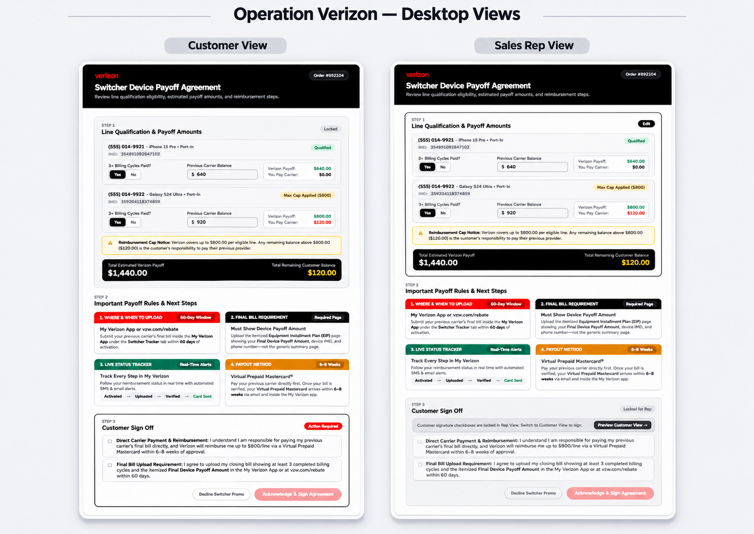
I designed the concept around two connected touchpoints: a representative-facing internal system and a customer-facing co-browse agreement. The information stays consistent, but the controls change according to who is using the screen.
Confirm installment tenure, enter estimated balances, and calculate the potential reimbursement and uncovered amount.
See locked eligibility values, read the requirements, and accept or decline the payoff agreement.
See the agreement outcome, upload the closing bill, and follow the proposed claim progress experience.
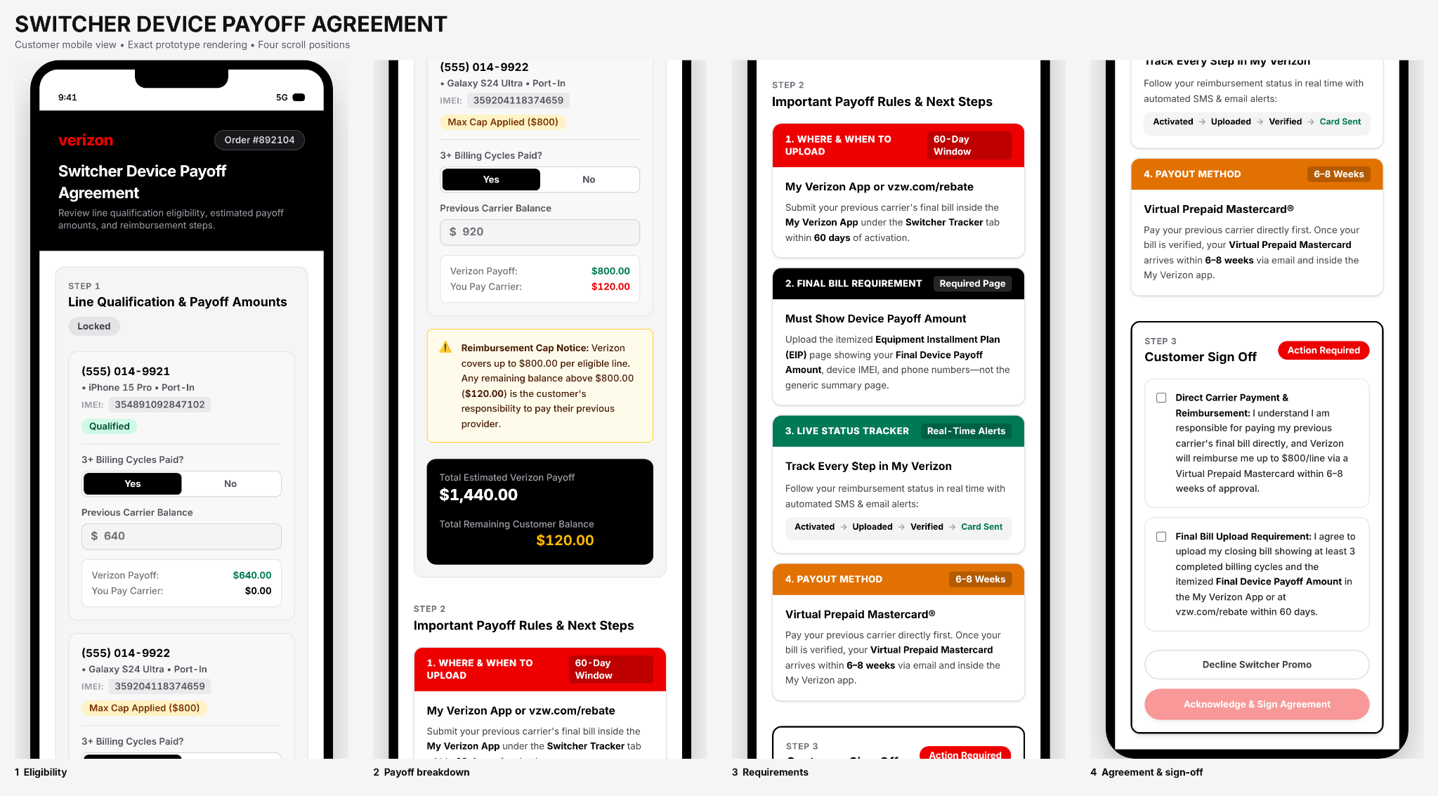
Customer agreement across four screen positions
The mobile experience moves from locked eligibility and estimated payoff amounts to reimbursement rules, then to customer acknowledgment. Each section has a clear purpose, with the sign action available only after both disclosures are acknowledged.
Try the Switcher Agreement
Explore the original concept in a separate tab. Review the representative and customer experience, enter sample qualification information, and test the agreement decisions.
Explore Interactive Prototype ↗Concept demonstration · Sample data · No live Verizon connectionFrom input to informed decision
The concept uses a sequence of checkpoints rather than treating the payoff conversation as a single disclosure. Each checkpoint has a specific owner, condition, and outcome.
Complete qualification first
The representative enters offer-relevant information, including installment tenure and estimated outstanding balances. Required fields must be completed before the next step becomes available.
Missing required fields → continue action unavailable.
Present the same numbers to both people
The customer sees the estimated reimbursement, any uncovered amount, and instructions. Values entered by the representative are locked in the customer view so the two experiences do not drift apart.
Representative-entered values → customer-visible, read-only summary.
Give acknowledgment to the customer
The customer reviews the disclosures and decides whether to accept or decline. The sign action remains unavailable until both required acknowledgments are selected.
One or zero acknowledgments → sign unavailable; both selected → sign enabled.
Required fields help prevent omissions, but a checked field alone does not prove eligibility. Similarly, acknowledgment documents an action, not perfect comprehension. The concept would need validated eligibility rules, accessible explanations, and usability testing before real deployment.
Interactive state logic
| Component | Sales representative | Customer co-browse |
|---|---|---|
| Eligibility and caps | Editable tenure confirmation and estimated balances | Locked values labeled as verified by the representative |
| Instructions and timeline | Read-only talking guide | Read-only upload steps and offer-specific deadline |
| Disclosures and sign-off | Waiting for customer acknowledgment | Interactive checkboxes; sign action disabled until both are checked |
Making errors harder to make
I chose a required qualification step because I wanted to do more than remind representatives of the rules. In a fast-paced sales environment, a small oversight can have significant consequences. My goal was to make the right action easier than the wrong one, without creating unnecessary friction.
Creating a shared understanding
People process and remember information differently. I wanted customers to see the terms while hearing them explained, rather than relying entirely on a verbal conversation. The acknowledgment gives both people a clear moment to review the requirements before proceeding.
This is an independent conceptual workflow using synthetic example values. Offer-specific requirements must be confirmed against applicable terms. The internal system is not named or connected to production services.
The Reaction
Designing what happens after the decision
The agreement does not end with a single sign button. I designed separate states for customers who accept the payoff promotion and those who choose to continue without it.
Agreement signed
The confirmation summarizes the example $1,440 estimated payoff, the stated upload deadline, and the proposed prepaid-card delivery method. It also directs customers toward the agreement and tracking information.
Promotion removed
The decline state makes the consequences explicit: $0 payoff reimbursement, the previous-carrier balance remaining the customer's responsibility, and a choice to return or continue with a standard port-in.
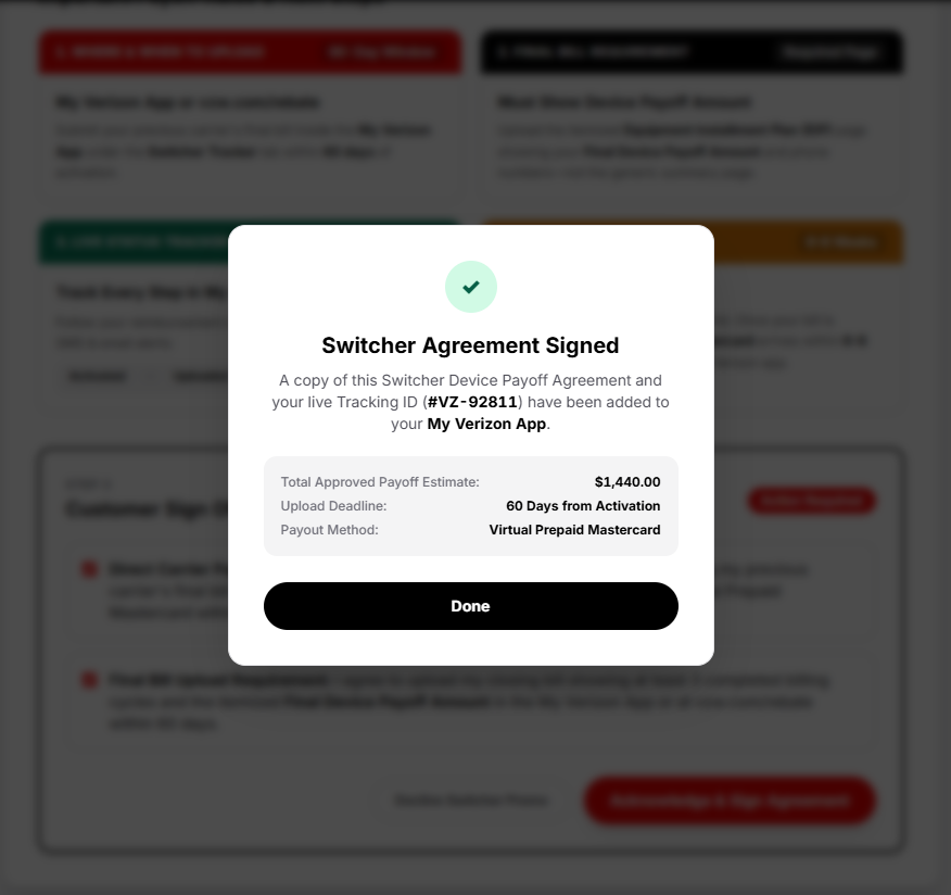
Confirmation summarizes the agreement and directs the customer toward the post-sale tracker.
Click image to enlarge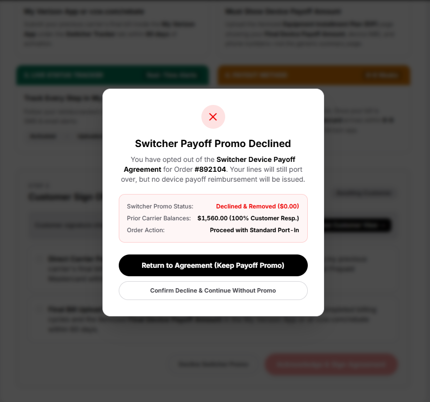
The customer sees the financial consequence and a way to return or continue without the promotion.
Click image to enlargeConfirmation provides a clear handoff to the post-sale requirements and payoff tracker.
View full-size screenshot ↗Confirmation makes the financial implications visible while preserving a path to continue without the offer.
View full-size screenshot ↗I didn't want the customer to feel forced into accepting the payoff promotion just to complete their order. Declining needed to be a valid choice, but the financial consequences had to be unmistakable.
Explore the Payoff Hub
Open the original post-sale concept to explore its claim checklist, card presentation, and simulated progress states.
Explore Payoff Hub ↗Concept demonstration · Simulated claim states · No actual reward fundsPOST-SALE EXPERIENCE / TWO INTERACTION STATES
From Pending to Payoff
I wanted customers to see the potential reward at the beginning of the journey, while making it clear that they still had steps to complete. The payoff hub connects the reward to a visible progress tracker, then provides a distinct completion state after the simulated claim process finishes.
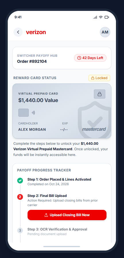
The card remains locked. A countdown and checklist direct the customer to upload their previous carrier's closing bill.
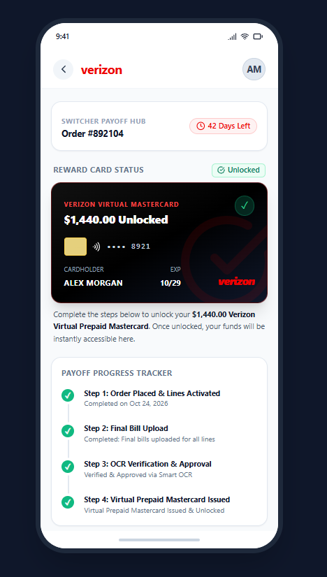
All four milestones show completion, and the card changes to its unlocked state after the simulated approval and issuance steps.
Making the reward feel within reach
I placed the locked reward card near the top because I wanted customers to see what they were working toward. Instead of presenting a long list of requirements with an uncertain reward at the end, the design makes the goal visible and connects it to clear next steps. As each requirement is completed, the tracker reinforces that progress.
Both screens show original conceptual prototype states with synthetic customer data. The document verification and reward issuance shown here are simulated interactions, not a live approved claim or available funds.
What I would test next
I would test whether customers understand who pays the previous carrier, identify the correct installment document, and recognize the deadline. For representatives, I would test whether the required qualification steps fit naturally into a real sales conversation. No usability results are claimed yet.
The Transformation
Designing for impact beyond the interface
My initial motivation was helping customers, but I also saw the potential business value. More reliable qualification and clearer post-sale guidance could reduce avoidable disputes, protect trust, and improve the efficiency of customer support.
I don't measure good design only by how polished the screens look. I want to know whether the experience helps people complete their tasks and whether it creates value for the organization supporting them.
Business impact: what I would measure
These are research-supplied baseline estimates and proposed targets, not measured Verizon outcomes. They establish a framework for a future pilot and evaluation.
Estimated baseline → proposed target
Estimated baseline → proposed target
Estimated baseline → proposed target
Measure cohort churn against a verified baseline
The figures above have not been independently validated against internal reporting. Reducing errors does not guarantee lower churn or specific financial savings; those outcomes would require controlled measurement.
How I would validate the redesign
Before treating any projected improvement as a result, I would test comprehension and task completion with customers and representatives, then evaluate a limited pilot against verified operational baselines.
Can customers explain the offer?
Ask participants to identify who pays the old carrier, how much could remain their responsibility, what document to submit, and when it is due.
Measure: comprehension accuracy, task success, and errors.Does the guardrail fit the conversation?
Observe whether representatives can complete required fields correctly without excessive interruptions, workarounds, or extra time.
Measure: completion rate, missing-field errors, and time on task.Does the experience improve outcomes?
With approved access to aggregated data, compare eligible cohorts and track claim submission, rejection reasons, support contacts, and 90-day retention.
Measure: verified baseline versus observed change.Proposed research plan only. No participants have been recruited and no pilot or production metrics are reported in this case study.
Lab Notes
I design for the whole experience
Operation Verizon taught me that small design decisions can have consequences far beyond the screen where they happen. What began as concern for one customer became an opportunity to explore an entire service experience.
I found myself thinking about the representative, the customer, the supporting systems, the business, and every moment connecting them. I realized that I'm a big-picture designer. I don't just want to design for one side of the interaction. I want to understand the whole experience and how its parts work together.
Being close to the front line has given me a perspective I might not have gained otherwise. While I continue growing toward product and experience design, I want to use that perspective to identify problems worth solving. Number transfers are another area I'd like to explore because I've seen how confusing that process can be for customers.
Sometimes the most meaningful design opportunities begin with a problem we care enough to investigate.
Project boundaries: This is an independent conceptual UX project, not officially endorsed by Verizon Communications Inc. Mockup screens and customer examples use synthetic data; research observations are separate. No proprietary internal code is represented. Prototype behaviors and business targets are not live outcomes.
Evidence: The project draws on frontline observations and secondary research. Complaint patterns, promotional conditions, and financial estimates require source-level verification before being presented as established facts.
Designing beyond the transaction
My biggest takeaway is that a customer experience does not end when a sale is completed. It continues through the documents, deadlines, decisions, and support moments that follow. I designed Operation Verizon to make those connections visible and give both sides a clearer path forward.